Tuesday, April 14, 2009

Carmel Mission


My DD would probably not approve of these photos of her. She calls this her awkward phase. But I love them. They show what a sweet, sweet child she was. When we studied California history in 4th grade, I really loved the missions. Probably went a little overboard with the teaching there, but it's the whole "if I'm stuck on it, you're stuck with it" scenario. Since we lived in San Jose, it was just a hop, skip and a jump to several of the missions. And since we had family in Pacific Grove, well we made several trips to Monterey. One was to the Carmel Mission and another was to the Adobe Tour (layout coming up soon for that trip).

I wanted a quick, easy layout since it was a holiday and weekend and lots going on. This one was a perfect fit for the season and for the time. The layout features 11 photos. I used 2 12x12 Bo Bunny dots for the background and 2 dfferent 12x12 Heidi Grace Designs from the "Love Bug" collection. I've also used a sheet of mulberry paper for mats behind the journaling and the main photo on the left side. The title is mounted on a 2 x 12 piece of beige Bazzill. I used a 2-way glue pen and some chunky glitter for the first word in the title and some more Heidi Swapp "Invisibles" stickers for the second word. There's a little hardware, some Bo Bunny brads, ric-rak and a little ribbon. I colored some clear buttons with alcohol ink and then adhered them with Diamond Glaze to the Heidi Grace Designs paper.

I think my favorite part of this layout was the journaling. This was taken from a year-end report my daughter wrote about Father Serra. I just love her line, "He liked bells alot." And, of course, her concluding sentence, "Don't you wish everyone had faith like Father Serra?" Like a said, what a sweet, sweet child.

Friday, April 10, 2009

Heidi Swapp Invisibiles


Three cards I created last week for the weekly Thursday demo. This time the product was the new Heidi Swapp Invisibles and Versamagic Chalk Ink. I had already made a layout using the Invisibles (see Family Shower). This time we made some cards. A really fun product, and the creamy Versamagic inks were perfect for the ink application, although you could use just about anything you want - distress inks, acrylic paints - but these were easy and smooth to apply and rub off the white resist very nicely.


Saturday, April 4, 2009

Family Shower


Last week I did a layout of the first of two bridal showers I was fortunate to attend down in LA the weekend of the 14/15th of March. Today's layout is the second one put on by Josh's family. I was a bit nervous about meeting "the fam" but they were all so nice. I was super glad to have had the chance and I feel so good about Allison's soon to be new family.

I was gone for a good part of the day, so I got started on this late. I seem to do my best work under pressure!! This week's layout features the new Heidi Swapp "Invisibles." Try them and find out for yourself what the excitement is all about. These are really fun to color and watch the invisible images pop out. For a complimentary page I used one of the new "Sew Cute" by Prima Marketing. The circles are cut from one 12x12 BoBunny Love Shack Shake, one 12x12 Heidi Grace Designs Sweetest Bug Charming Cottage, and one 12x12 solid Bazzill. Embellishments include BoBunny Swirls & Brackets Chipboard stikers, Prima Flowers, and an adorable wooden laser cut "Flutterby" by Scrap FX. Some ribbon and crystals finish off the pages. The title is some 7 Gypsies rub-ons and Heidi's "Invisible" alpha stickers. Don't you just love all the dots on this layout combined with all those circles?

Friday, April 3, 2009

Allie and Josh


When she said, "Mom, do you think you could make these for my cake topper?" I said, "Sure, no problem." Wow, what was I thinking? Hats off to you, Ann Wood. Your birds are so adorable and so wonderfully made. No one can copy you. But after months of trial and error (at least 4 in the trash I think), I did finally come up with what I would call "The Best Imitation Ann Wood Birds" I've seen. We actually ended up ordering one of her non-sweetheart birds just to be sure we were on the right track. And I would also recommend this hilarious article. It seemed like we'd never have a chance to order one of the cake topper pairs; they sell out almost immediately. So I am grateful I was able to make these. Allison would have been crushed if I had not been successful. Her cake lady is doubting their ability to remain upright on the sea of frosting but there is something wonderfully expressive about these little stuffed creatures. And yes, Josh does have a top hat now.

Here they are from the back:

Getting so excited for the wedding now. Only 2 1/2 weeks to go. Glad this one BIG task is done.

Thursday, April 2, 2009

Light Alcohol demo

For the demo, we played with Ranger's new "light" alcohol inks. I also wanted to show how to use the new smaller masks from Tim Holtz and his wonderful hardware. It's not quite super apparent in the photo, but those daffodils (stamp set by Hero Arts) stamped with Brilliance yellow look fanastic. They shimmer and shine just like spring coming into our lives after a long winter. The Happy Spring is an old Stampa Rosa stamp. Sorry, they are no longer in business. Just one more reminder that when you see a stamp you like, you should get it then, because they won't be making them forever.

I really did not like this background at all when I first made it, but after putting it together as a card, well I love it now. The "Amen" verse is a stamp by Limited Edition and the cool metal frame is one of Tim's.
.
This last card is just another example of how with alittle something extra these polished stone backgrounds really make a nice collagey card.

Happy spring!

Friday, March 27, 2009

True Friends


I'm loving tomorrow's layout with some fun new Tim Holtz products that just arrived at Creating Lasting Memories including sprockets, spinners, journaling tickets and salvage stickers. The fun has just begun because I also picked up his corners, foliage, long fasteners, trinket pins and ornate plates. You can be sure I will be using them on some of my upcoming layouts. I asked Marti to wait and not put this stuff out for sale until after my class tomorrow so you guys can be first to purchase. After tomorrow, it will be out in the shop for sale. The background paper I used is 2 12x12 of some real elegant glittter and embossed designs by Best Creation Inc. I also used 2 different colors of solid Bazzill one of which is bling. I have used rubons by Kaiser Craft and 7 Gypsies, tiny alphas by Making Memories, a glasine envelope, a metal edged vellum tag and a small amount of fiber. As you can see, it takes quite a few photos. The large one is appromiately 5x8. Wouldn't you love to come play with me tomorrow? If you live near Brookings, Oregon, stop by and create this layout. Class begins at 10:30am.

Thursday, March 26, 2009

New fun with chalk


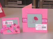
My demo this Thursday is showing some of the many uses of chalk. This first card was all about using chalk to color a solid image. I glammed it up a bit with lots of little crystals at the end of the flower petals. The ribbon was colored with chalk to match the background paper.


This second card shows how easy it is to color inchies using chalk. Soft and effective. It is best to try and use the same 3-4 colors.