
Its another color challenge from Kristina Werner. I needed a thank you card and this seemed just the ticket. I love fall and I love these fall colors. Decided to go with
 a really fun technique: dye inks dabbed on glossy paper.
a really fun technique: dye inks dabbed on glossy paper.
a really fun technique: dye inks dabbed on glossy paper.

 I promised more layouts from the wedding scrapbook I'm currently working on. As I said, the color I'm working with is red. But I love how this one came out, and my favorite part is the title. But I was not happy when the girls were looking off the page (bottom layout). So I reversed image in Photoshop (top photo). Way better. I don't know how the program does it, but I think it's amazing.


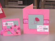
 Two little happy cards for this week's challenge. The challenge for me was to make four colors not look too busy. I did find I could mix and match the pieces using the different colors of card stock. Fun! Thanks for another great time, Kristine.
 I've been doing a wedding scrapbook for a couple that chose red for their color. Here's a bunch of papers laid out for viewing and selecting for the next layout. I did two layouts this weekend but I haven't taken pictures of them yet so I will post that tomorrow. It has been a stretch for me to use that color. I usually go for pastels over primaries. But I am really pleased with how they are coming out and (most importantly) is the bride.
 Layout for class this Saturday. I got a request to use the Tinkering Ink Al Fresco line of papers....very bright prints. Fortunately, on the back side of one of the patterns was this lovely soft blue. So I added some of the prints sparingly to come up with this. The layout makes me smile and ultimately, isn't that what this hobby is all about? I think they are one fantastic looking couple. And forgive me if I sound like a grandmother-to-be, but I can't wait to see how darn cute their kids will be. And don't you just love those Bo Bunny rubons? Anything with a bird is ok by me. But swirls and birds is just about perfect.
 I'm also teaching an acrylic album class Saturday using the same line of Tinkering Ink papers. For that mini-album I used photos of my daughter when she was much younger, actually when she celebrated her 7th birthday. Sometimes it seems like it was just yesterday.





 Posts
All Comments
Posts
All Comments


